Phone:
(701)814-6992
Physical address:
6296 Donnelly Plaza
Ratkeville, Bahamas.

Phone:
(701)814-6992
Physical address:
6296 Donnelly Plaza
Ratkeville, Bahamas.
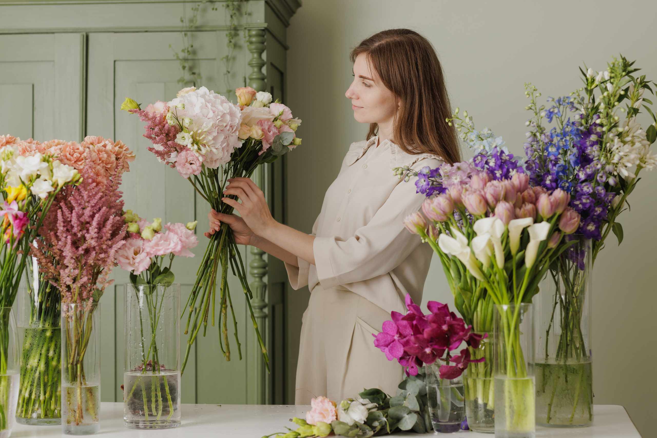
The first attribute that catches a viewer’s eye in a floral composition is the color; however, color has always been one of the more challenging elements to grasp as a novice florist. An assembly of gorgeous flowers will still seem off when the color relationships are uncertain. Many newcomers perceive the process of color harmonization as something purely instinctual; either one is gifted with it or one is not. This is certainly not the case in floristry where color harmonization is merely a skill which is refined and perfected over repeated exposures.
The most straightforward means of developing your color harmonization is to limit the color palette intentionally. Start by choosing just two flower colors and one greenery color. You can focus on the shapes by using fewer flowers, so that you will pay attention to the color. For example, white and pale green can demonstrate how slight variations can create a feeling of freshness, whereas, peach and burgundy can showcase how warm hues can combine to create depth. Purple and yellow can be utilized to produce an excellent contrasting effect; however, care must be taken as an overbearing use of purple or yellow can produce a jarring visual effect. A common error that people make is to add a multitude of colors in the hope of producing a more interesting design; however, this often has the opposite effect and the resulting effect is that the eye has nothing to rest upon. If this is the case, remove the color that appears least frequently or the one that stands out and study the new result. In many cases, the new result provides the much needed clarity.
Another useful tip is to decouple color from the particular species. Beginners often tend to concentrate on the characteristics of the bloom and whether or not the bloom in question is a desirable one and overlook the fact that what the bloom is offering to the composition in the way of color. Place the flowers on a table and arrange them according to color groupings and see which ones seem to stand out and which ones appear to recede. Select a color which seems dominant, another one that complements it and a third one to serve as the accent color. If it appears only once, the arrangement may feel accidental; if it is used too extensively, it will not stand out. When used correctly, an accent color, featured two or three times, will create a sense of rhythm and harmony within the flower arrangement.
In case you have difficulty determining why a specific color scheme fails, check the temperature first and refrain from trying to change the arrangement as a whole. In general, warm colors such as coral, rust, peach, and golden yellow tend to come forward. Cooler tones like lavender, blue-green, and icy pink often recede. Most often, errors can be detected when the warmest color is situated in a specific area of the arrangement or when a color scheme which is predominately cool is spoiled by an errant flower of a very different color. If this is the case, construct the same composition twice with the same flowers; in the first instance, center the warmer color and in the second instance scatter it sparsely and then take pictures of both compositions to see which one works better. This will provide insight as to placement as well as the color scheme itself.
A 15-minute session focused on developing color harmonization skills should be beneficial for most flower lovers. Begin by laying out the selected flowers and removing any which are not in good condition. During the next period of time, arrange the flowers in a compact manner by selecting just three colors and observe the point at which the strongest color is positioned and where the eye falls afterward. Conclude the session by taking one photograph of the arrangement from up close and one from a greater distance and then determine whether the overall color scheme is soothing, vibrant, cluttered, or disorganized. Finally, note what seems to work effectively and which elements do not. Over several practice sessions, patterns will gradually develop. It may be noted that you have a tendency to overuse contrasting color or that some of your best results are the ones in which a subdued tone is accented with a richer color tone.
Learning how to color coordinate effectively will become a bit easier when one stops thinking about it as some sort of riddle. The actual exercise is to edit, observe, and test slight variations. The more one compares and contrasts, the more deliberate the choices become. Flowers will always possess the capacity to provide a pleasant surprise, and this is one of the main qualities which make them so appealing. Over time, however, the eye becomes increasingly refined. Eventually, an observer will be able to recognize when a particular hue needs to be muted, when it requires repetition, or when just one single flower can provide the final element to make it truly memorable.